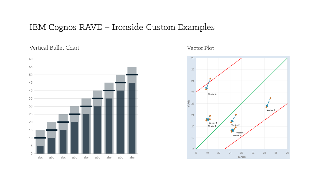
Rapidly Adaptive Visualization Engine (RAVE) is the technology behind IBM’s extensible visualization offering. With the ability to create your own visualizations and to utilize those that others have created, the bounds of what have historically been accepted as the limits of IBM Cognos charts and graphs are gone.RAVE visualizations are far more advanced than what we are accustomed to. They are interactive, animated and are available in more variety, including heat maps, spider maps, tag clouds, bubble charts etc. In this article, we’ll take a look at where to acquire and how to start using RAVE visualizations. You’ll find that it is surprisingly easy to implement in just a few short steps.
Where to get Visualizations?
At present you can download the new RAVE visualizations at IBM’s site http://www.analyticszone.com by going to the Downloads tab and selecting the extensible visualization link on the far right.
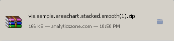
Here you’ll find a nice variety of the types of visualizations that have already been created. Select the visualization that you’d like and download it (You will need to be registered on this site). The download will manifest itself in the form of a .zip file.
You can also join Many Eyes, an online community where these visualizations are shared and developed.
Installing Visualizations
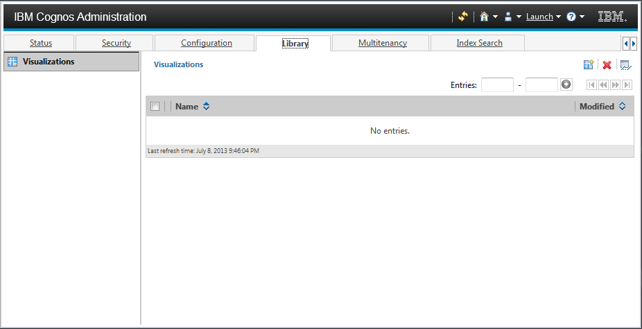
IBM has made the installation process easy. No editing XML files or shuffling content around your installation directories. To install these visualizations simply go to Cognos Administration and select the Library tab shown below.
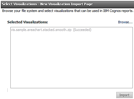
Select the Import Visualizations button ( ) and browse to your downloaded visualization zip file.
) and browse to your downloaded visualization zip file.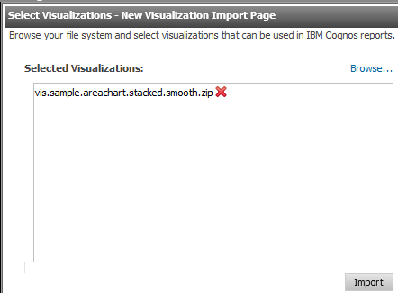
Click Import.
Note: There is no need to restart services after the visualization(s) are imported.
Using Visualizations in Active Report
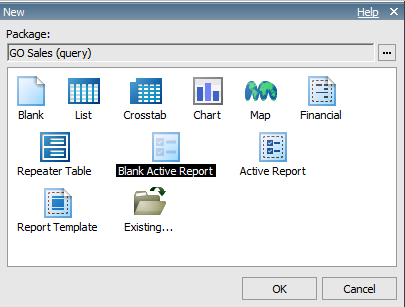
Now that the visualization is installed, let’s make our way over to Report Studio and create a Blank Active Report.
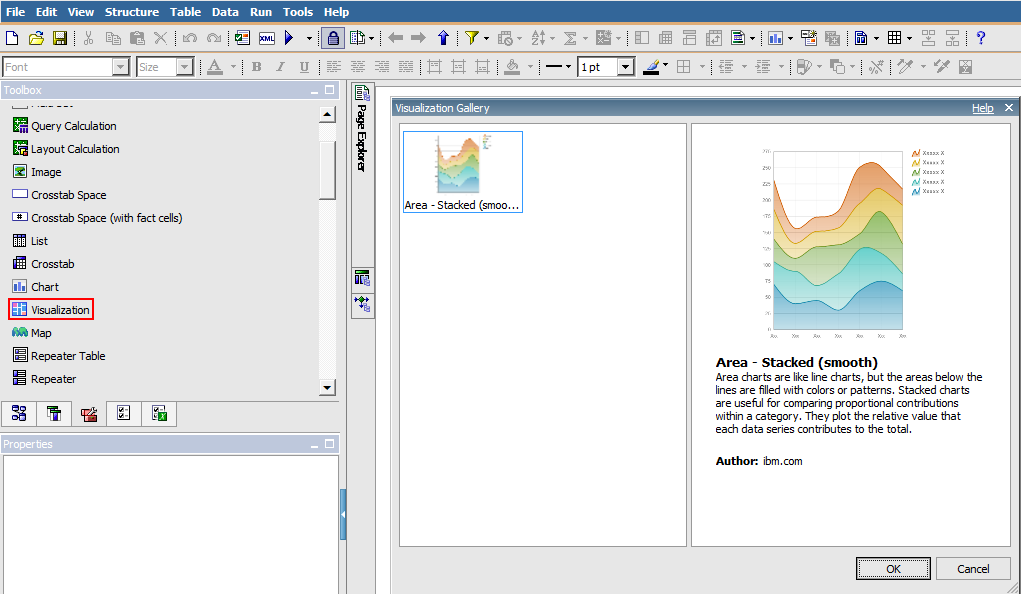
You’ll notice there is a new Toolbox item called Visualization. We can drag and drop that into our page and find that we can now browse our gallery of visualizations from within Report studio. At this point we are back into known territory and can utilize Report Studio to populate data and format as we see fit. As with all IBM Cognos charts (both legacy and current), each type of visualization may have their own unique set of formatting options and functionalities.
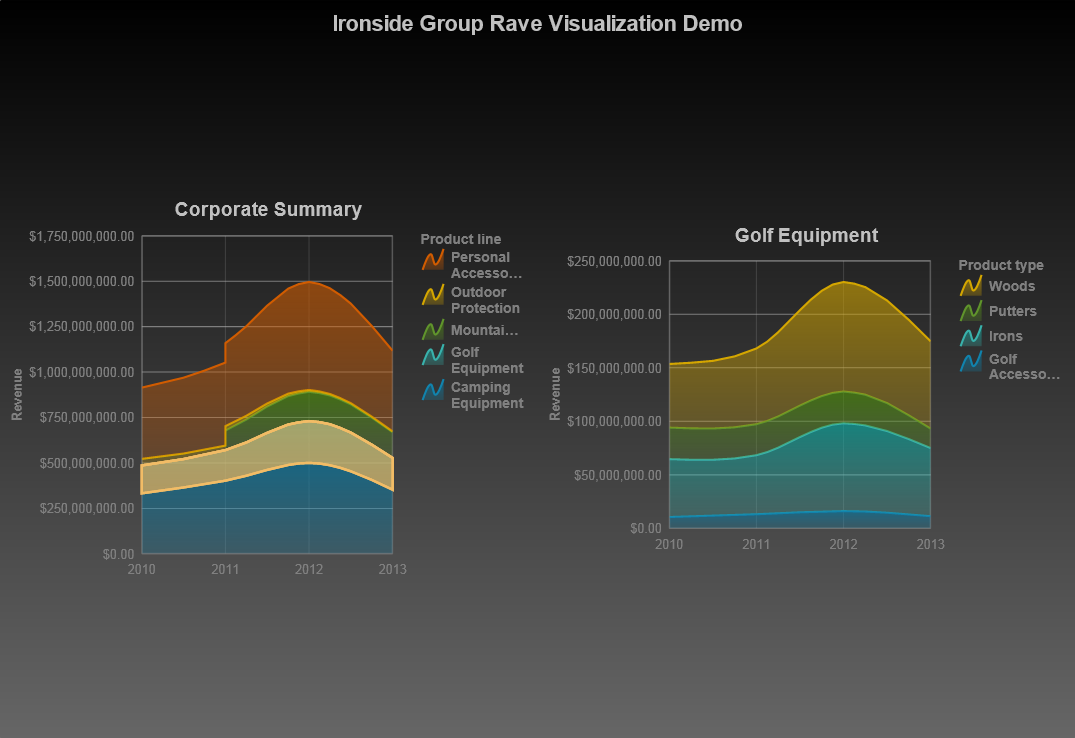
Below are screenshots of some Active Reports were created using GOSALES (query) data.
Comparing IBM Cognos RAVE vs. Tableau, Tibco and Qlikview
Adoption of data visualizations has grown significantly in recent years, as evidenced by an upswing for visually dominant tools in the Gartner Magic Quadrant Survey for Business Intelligence and Analytics Platforms. From 2011 to 2014, tools such as Tableau, Tibco Spotfire, and Qlikview have moved from in or near the challengers quadrant to the leaders quadrant, alongside more traditional BI tools, like IBM Cognos, Microsoft, and SAS. Additionally, the TDWI Best Practices report, Visual Reporting and Analysis: Seeing is Knowing, has indicated that this growth has not yet peaked. According to their research, “data visualization is in the middle of a remarkable growth phase” and contributes significantly to increased insight and productivity.
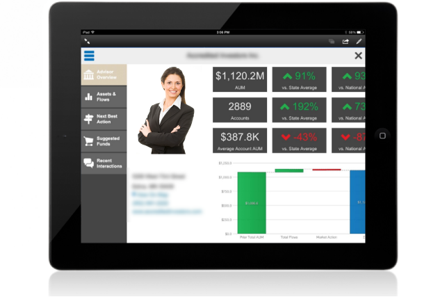
While historically IBM Cognos has not been lauded for its aesthetics, times have changed and so has IBM Cognos BI for the better. Advances in Cognos visual capabilities with Cognos 10+ have reduced the need to leverage additional tools to present data in its most visually appealing format. With the advent of RAVE (Rapidly Adaptive Visualization Engine) visualizations, particularly when used with Active Reports, Cognos users can experience interactive visualizations every bit as powerful and beautiful as those found in those other visual analytics tools. Combine that with your enterprise data via native mobile delivery (tablet) and you’ve got all you need to present your data in a stunning and easy to interpret format.
A picture is worth a thousand words
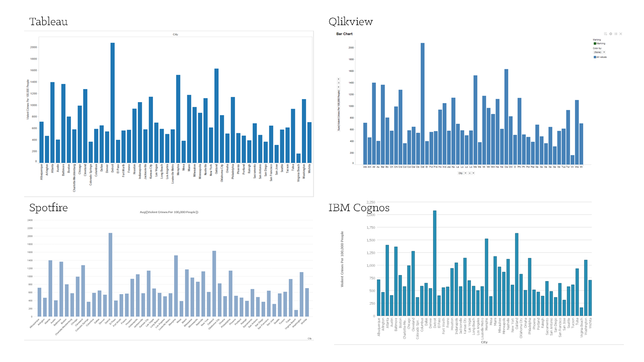
Let’s compare some of the visualizations side by side so you can see for yourself the appeal of RAVE visualizations. (Chart Descriptions courtesy of AnalyticsZone.com). The software versions used in this comparison were IBM Cognos 10.2.1, Tableau 8.2 (Trial Version), Qlikview 11 (Trial Version), and Spotfire Cloud.
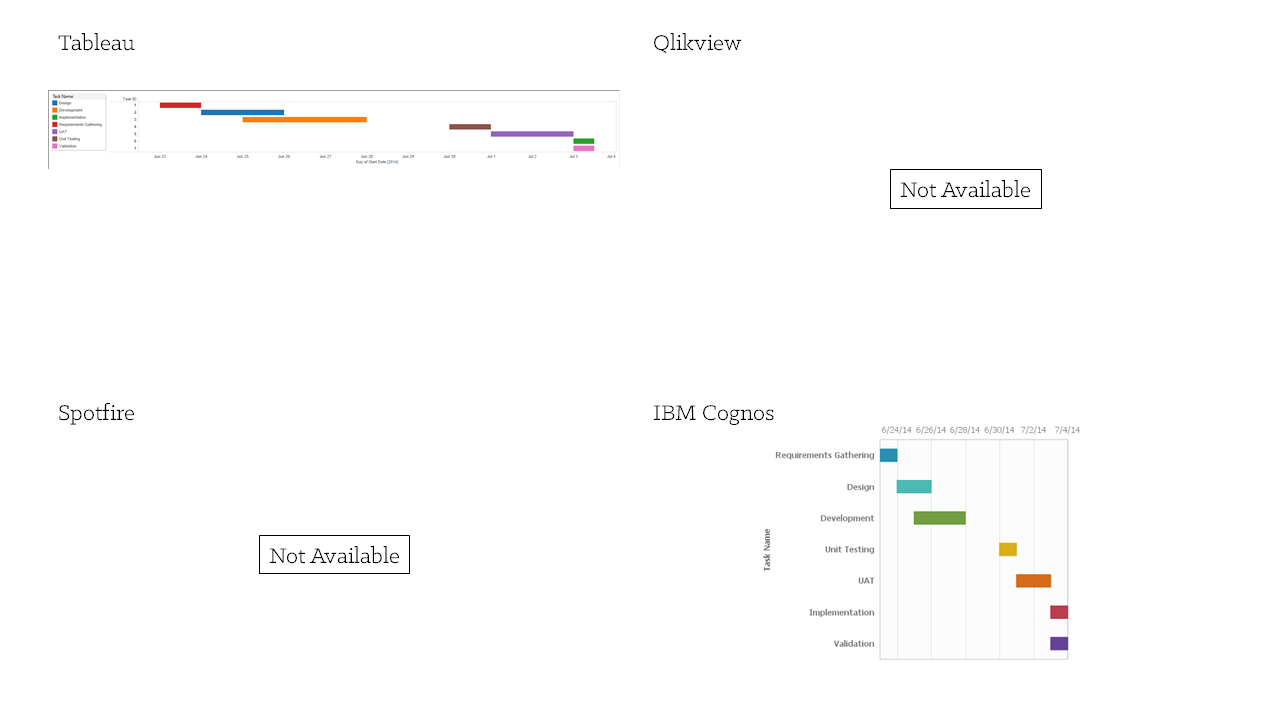
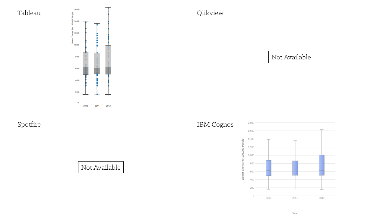
Editor’s Note: Since initial publication of this article, it has been brought to our attention that additional functionality and visualizations are available in the full Qlikview tool that may not be represented in this comparison. Namely, Gantt Charts and Box Plots are native chart types available in Qlikview.
Bar Chart
Bar charts use horizontal data markers to compare individual values. You can use bar charts to compare discrete data or show trends over time. Use clustered bar charts to compare values across multiple categories.
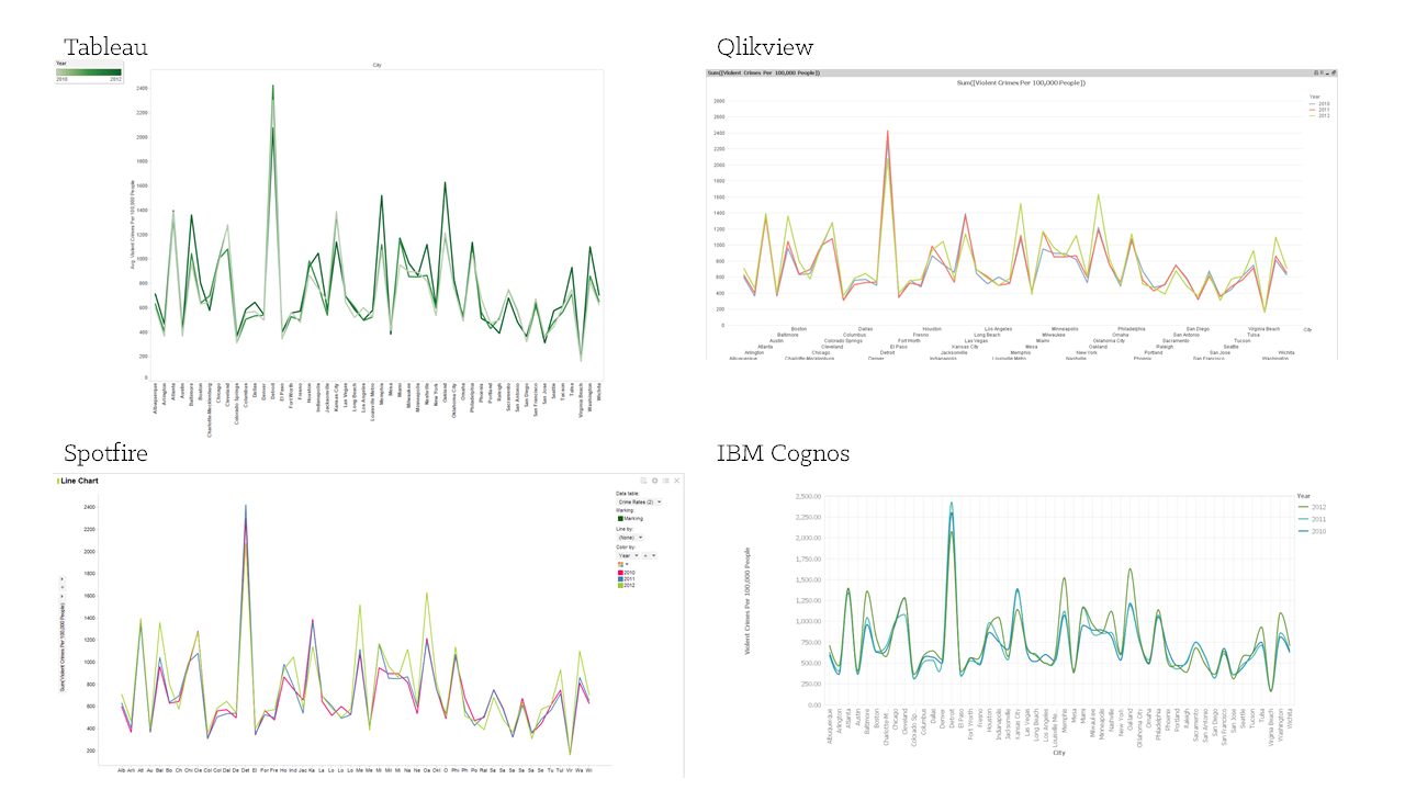
Line Chart
Line charts plot data at regular points connected by lines. You can use line charts to show trends over time and compare many data series.
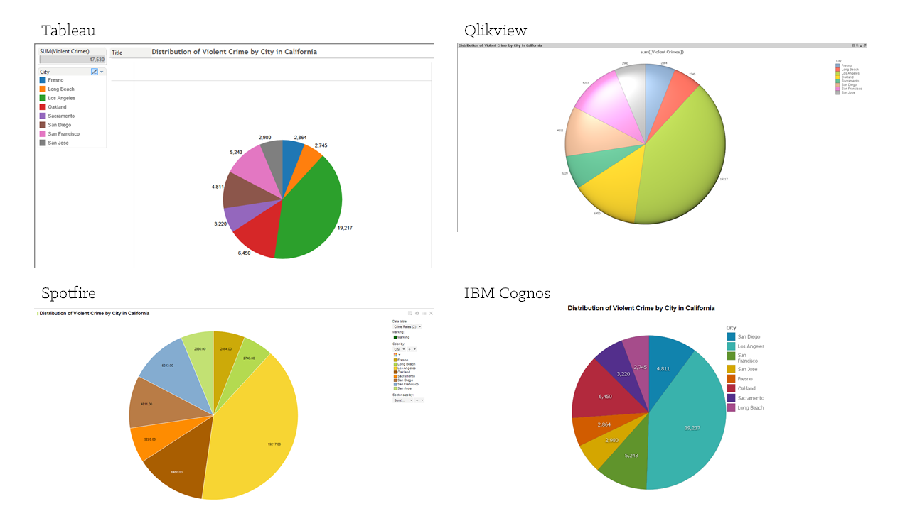
Pie Chart
Pie charts use segments of a circle to show the relationship of parts to the whole. You can use pie charts to highlight proportions.
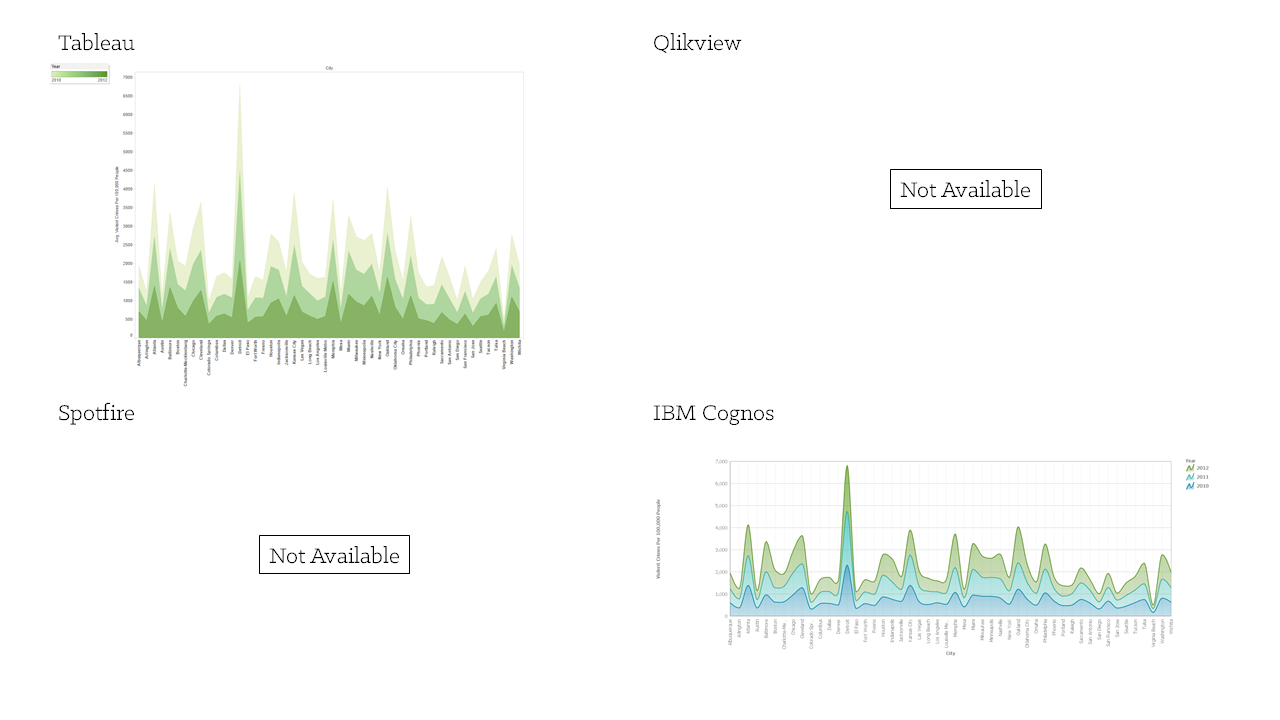
Stacked Area Chart
Area charts are like line charts, but the areas below the lines are filled with colors or patterns. Stacked area charts are used to show the relationship of parts to the whole. You can use area charts to emphasize the magnitude of change over time.
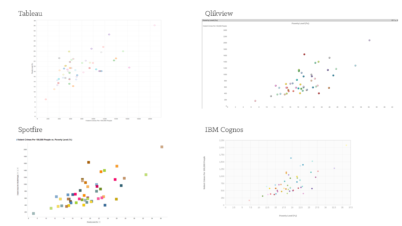
Scatter Plot
Scatter charts use data points to plot two measures anywhere along a scale, not only at regular tick marks. You can use scatter charts to explore correlations between different measures.
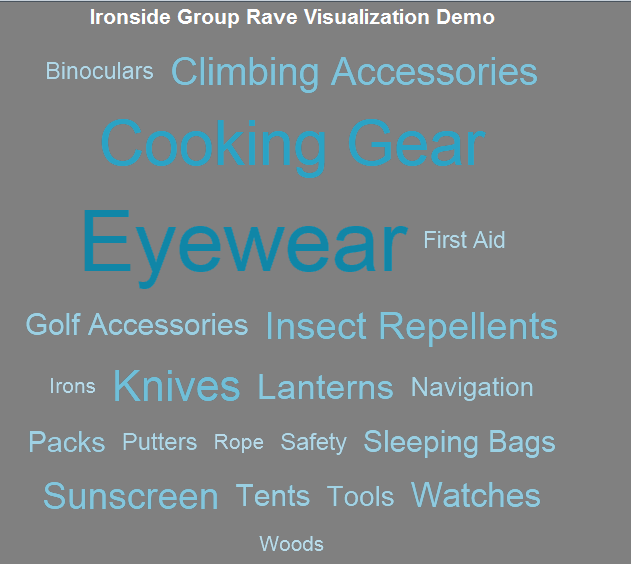
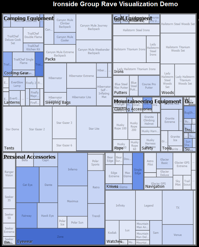
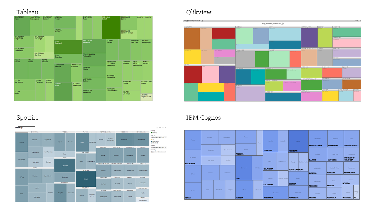
Treemap
Treemaps show relationships among large numbers of components using size and color in a set of nested rectangles. You can use treemaps to identify patterns and exceptions.
Gantt Chart
Gantt charts are bar charts that illustrate a schedule or timeline by showing activities displayed against a date or time series.
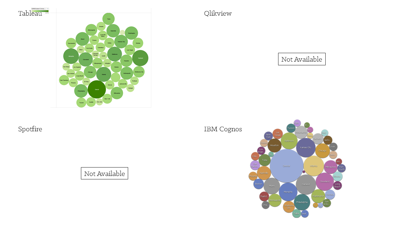
Packed Bubble
A packed bubble chart contains bubbles that are tightly packed rather than spread over a grid. You can use packed bubble charts to display a large amount of data in a small space.
Box Plot
Box plots show the statistical summary of a distribution of numbers, such as median values, upper and lower quartiles and outliers.
Bonus
You’ve seen in some of the above comparisons that occasionally tools lack visualizations that others have. What if you happen to need a visualization that isn’t available? With IBM Cognos BI and RAVE Visualizations you can create it using the RAVE design language and the freely available RAVE customization tool.
Visit Analytics Zone and explore the robust inventory of existing visualizations. Simply download and import the visual you want to leverage and you will be on your way to creating captivating reports and dashboards.
Managing a business data is not an easy thing, it is very complex process to handle the corporate information both Hadoop and cognos doing this in a easy manner with help of business software suite, thanks for sharing this useful post….
ReplyDeleteRegards,
cognos Training in Chennai|Best COGNOS Training Institute in Chennai
It was really a nice post and i was really impressed by reading this
ReplyDeleteTableau Online Training
very nice post,keep sharing more blogs with us.
ReplyDeleteThank you.....
cognos tm1 online training
Thank you for sharing this article !! qlikview report editor is a software vendor specializing in data visualization, executive dashboards, and self-administration business knowledge items. Analyst firm Gartner consistently rates qlik as one of the top information perception and business intelligence (BI) merchants on the lookout, including Tableau and Microsoft.
ReplyDelete